
With the Golden Globe winners announced last night and the BAFTAS on the horizon, let’s not forget about the often over-looked, Key Art Awards.
The Key Art Awards is entertainment’s most recognised competition for advertising and communications across every medium you can think of. Everything from the more obvious forms of advertising such as trailers and poster art/one-sheets, to creative social, TV spot and display campaigns – everything that goes into attracting an audience. Without the creative minds behind the marketing campaigns, cinema would not be as successful as it is today, and it’s great to see this side of the creative process recognised.
You can check out the huge list of award winners across all of the categories here:
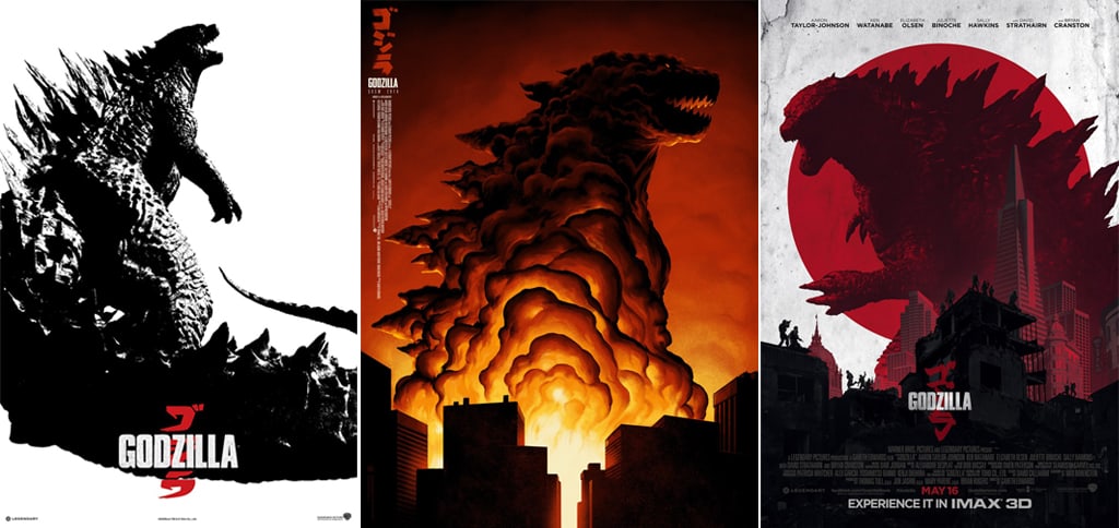
Being a unit stills photographer and keen studio shooter, I was most interested in the 46 winners of the printed medium – the poster art. There are so many great winners this year but Godzilla was slightly ahead of the pack, being recognised for 4 awards. Paying homage to the Japanese origins of the story, many of the posters for Godzilla chose to take a graphic approach over a photographic one and give the one-sheets a style one might expect to see in a manga. Manga is something I’m recently discovering an appreciation for though more for the artwork than the story, so perhaps this is why I particularly like the middle image, which won ‘Best Theatrical Festival One-Sheet.’
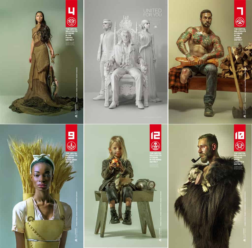
Following closely behind Godzilla is The Hunger Games with 3 entries into the awards, and with its ‘District Heroes’ campaign taking gold in the Theatrical Domestic One-Sheet category. I personally really love the images put out for the Hunger Games and in fact think the concept behind the entire campaign is nothing short of genius. Each series of the one-sheets acts as a propaganda campaign ostensibly created by the opposing sides of Snow’s Capitol and the rebellion, with the latter having Katniss Everdeen as their poster girl. Making it into the 2014 Key Art Awards for print are propagandist posters seemingly created by Snow, whose penchant for manipulation and indoctrination come through in an unsettling way as he appears to hail the citizens of Panem’s compartmentalised districts. Whereas we are normally introduced to films by a poster, trailer or other form of media directly telling us about it; the campaign behind The Hunger Games franchise completely removes the fourth wall and as a result is much more successful in drawing us in (I know I was at least). Lionsgate’s creative campaign strategy doesn’t however limit itself to posters – check out the huge array of propagandist videos, websites and installations that really give the impression that the war going on in the films, isn’t entirely fictitious.
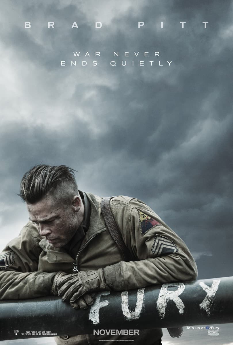
Despite feeling the need to back my fellow photographers, the rest of the stand-out posters for me are from graphic artists, though saying that, I must tip my metaphorical hat to Giles Keyte for his excellent shot of a contemplative Brad Pitt against a foreboding sky for Fury. Definitely a film on my to-watch list.
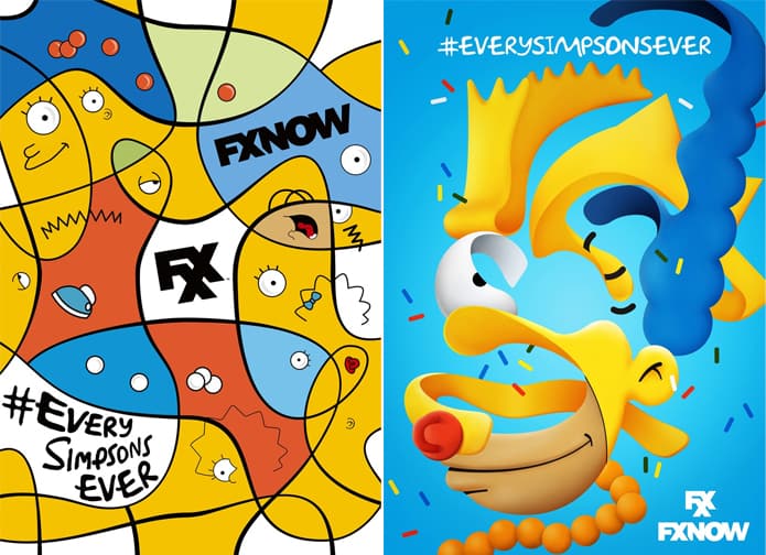
Though it’s been a while since I’ve been an avid watcher of The Simpsons, its recent advertising campaigns have been nothing if not viral, at least in the US anyway. Making it into the Key Art Awards for print are two posters for the show which have clear fine art influences; as if to imply that the Simpsons have a modicum of culture between them. The juxtaposition of the characters’ often simple and slapstick humour being advertising through fine art inspirations is actually quite effective, and the family’s instantly recognisable colours and signature features seem to be the only thing we need to see to know what’s being advertised. That’s when you know a cartoon is successful. That and the fact that FXX have recently paid $750 million for exclusive rights to all 552 episodes, which it brag about with the campaign hashtag; #everysimpsonsever. Below are the two images that took silver for being the best bus shelter artwork.
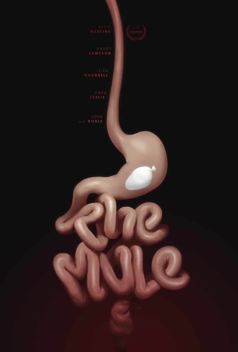
Still looking at graphic art is Concept Arts’ one-sheet for The Mule, which successfully makes my stomach knot and makes it clear that the film is nothing to do with the equine version of its title. My morbid curiosity has certainly been piqued with this one and Concept Arts get a silver award for it in the category of Theatrical Festival One-Sheet.
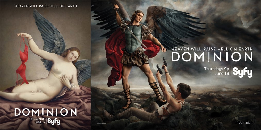
With the show being centred on a war between humanity and angels, it’s no surprise to see the one-sheets for Dominion putting a modern, and seemingly sinful twist on paintings that look like they could have been crafted by Leonardo Da Vinci. It’s great imagery like this that makes me want to subscribe to the Syfy channel.
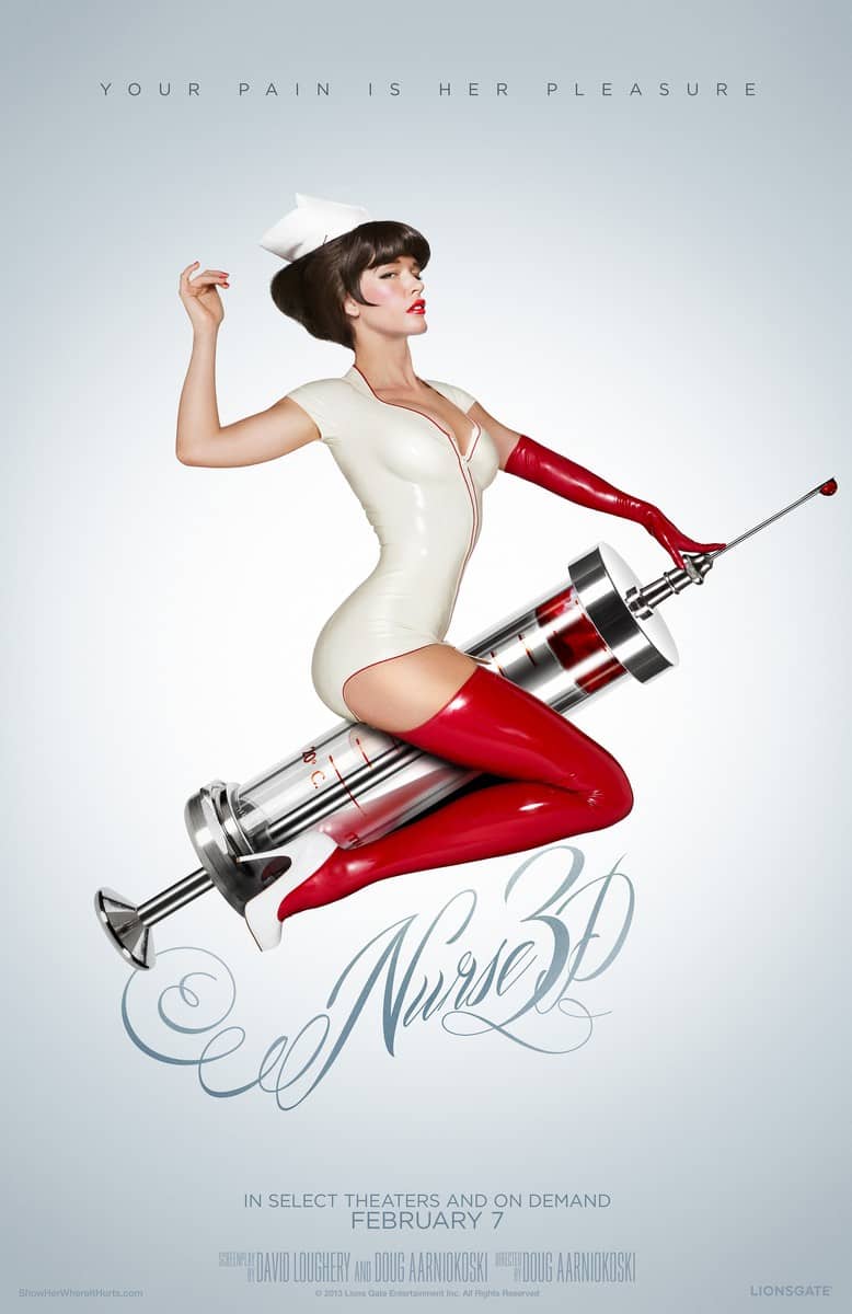
Finally, though not winning an award, there’s no surprise that the poster for Nurse 3D has been listed as a finalist; despite its lack of originality, everyone knows sex sells, and besides, what’s not to love about a hot latex-clad nurse straddling a phallic object? Effective but playing it decidedly safe as far as creativity goes.
Into marketing or just curious about what it takes to promote film productions and TV shows? Don’t forget to check out the plethora of other categories HERE and let me know which creative idea stands out most to you!